CSS Columns
Text breaking option is not the most popular text option ever since magazine layout. Just like in printing design, there are columns in web design too. The best and clearest way to use it is column option in CSS.

Text breaking option is not the most popular text option ever since magazine layout. Just like in printing design, there are columns in web design too. The best and clearest way to use it is column option in CSS.
If you are interested in text underline option, which is much more attractive, check it here.
It is boring, content and design-wise, for text content to be extended over the full web page, so this is rare to see. For more information about positions in CSS check this text. Please note that the blog content is left out of this because of its nature.
So, textual content on the web is organized in smaller width elements and because of that, there’s no need for columns. After all those facts listed, I needed columns last week on a design I’ve worked on, and it was fully justified (but left aligned).
Properties linked to the columns property are:
- column-count - specifies the number of columns an element should be divided into,
- column-width - specifies the width of the columns,
- column-gap - specifies the gap between the columns,
- column-rule - sets the rule between the columns (it is a shorthand property for setting rule width, rule color and rule style),
- column-span - specifies how many columns an element should span across.
Internet Explorer 9 (and earlier versions) and Firefox do not support column-span - column-fill - specifies how to fill columns (auto or balance).
The columns property alone will accept column-count, column-width, or both properties.
Let me explain these properties a little bit.
The column-width property specifies a suggested, optimal width for the columns. If the column-count is defined, the column-width value will be overridden.
The column-fill property is only available in Firefox. Content with column-fill balance will automatically balance content in a height-constrained multi-column layout. Other browsers will always fill columns sequentially when given a height constraint.If you want the same behavior through all browsers just set column-fill: auto.
Content that can be edited this way must be into one of the next element <p>, <div>, <h>, <ul> and <ol>. If the height of the columns isn’t defined, the content divided into columns defines height.
Examples
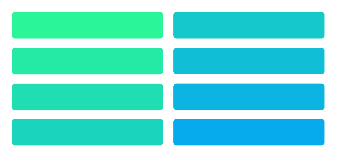
This example represents breaking content into 2 column.
(I used gradient to present content flow)
    <style>
        div{
            -webkit-column-count: 2; /* Chrome, Safari, Opera */
            -moz-column-count: 2; /* Firefox */
            column-count: 2;
            }
    </style>
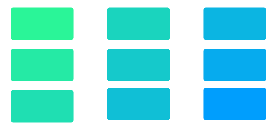
This example represents breaking content into defined width column with a defined gap between them.
    <style>
        div{
            -webkit-column-width: 300px; /* Chrome, Safari, Opera */
            -moz-column-width: 300px; /* Firefox */
            column-width: 300px;
            -webkit-column-gap: 150px; /* Chrome, Safari, Opera */
            -moz-column-gap: 150px; /* Firefox */
            column-gap: 150px;
            }
    </style>
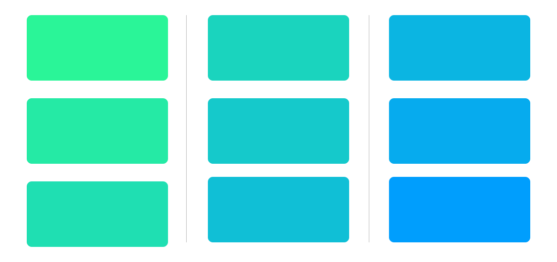
This example represents content staggered into 3 columns with defined rule between them.
    <style>
        div{
            -webkit-columns: 3; /* Chrome, Safari, Opera */
            -moz-columns: 3; /* Firefox */
            columns: 3;
            -webkit-column-rule: 1px solid #dbdbdb; /* Chrome, Safari, Opera */
            -moz-column-rule: 1px solid #dbdbdb; /* Firefox */
            column-rule: 1px solid #dbdbdb;
            }
    </style>
The last example represents content into columns and element which include all columns width.
    <style>
        div{
            -webkit-columns: 3; /* Chrome, Safari, Opera */
            -moz-columns: 3; /* Firefox */
            columns: 3;
            }
        h1{
            -webkit-column-span: all; /* Chrome, Safari, Opera */
            column-span: all;
            }
    </style>

I believe this is everything there is about column property in CSS. Hope it helps!
If you want to read more about CSS and web design, check this blog hourly for it, or just subscribe
Creating
software solutions
that work


