Media Queries

Reading this post, I take it you know things like internet(daaah), browser, responsiveness and good music (I can only hope). With that in mind I will continue the story...
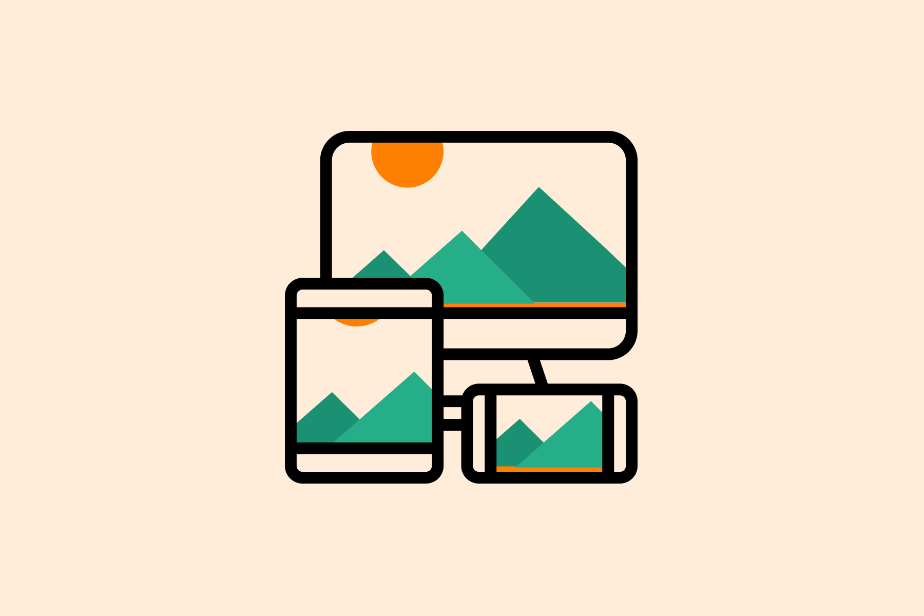
Every presentation made for the browser (web presentation) in today's world, can be seen through millions of different devices (if the presentation is lucky) with different dimensions (in any case). So while the Web presentation is in progress, responsiveness is always in mind.
About
To make the right experience with full content on every device you should first predict all the device's cases, then prepare design changes for all of them and at the end define all that in code.
Media queries are used in CSS to define specific cases and behavior in those cases.
The most common use of this technique is defining different screen sizes (responsiveness) even though originally, media queries are used for targeting device type (print, screen, speech, scan). Media queries can differentiate based on specific characteristics (color, update, orientation, aspect ratio), parameters (resolution, width, height) or combinations thereof, aligned with the device type.
How to Use
A media query is composed of an @media word followed by media type or media feature. After desired expression definition goes inside of {}.
All conditions except device type should be written inside of the (). To compose media queries, logical operators (not, and and only) should be used, and for combining you should use a comma.
Some examples:
 @media print and (color)
 {...}

 @media (aspect-ration:11/5)
 {...}

 @media screen (min-width:30em) and not (orientation: landscape)
 {...}
Media queries lack support in older versions on IE, so the keyword only should be added to syntax so those browsers don't include the following code without including conditions.
*The default value for the device type is all.
Breakpoints
One of the biggest CSS pending mysteries is "Which breakpoints to use".
I will present the answer to a much easier question "Why use breakpoints". So the answer is because you want to define fictional boundaries and after that define states between them. You also want to add as few states as possible to define, and you want these states to cover all devices right.
The idea is to avoid this case:
@media only screen and (device-width: 320px) and (device-height: 568px) and (device-aspect-ratio: 40/71) {...} /* iPhone 5 */
The first breakpoint system I want to present is one we all have been using - Bootstrap layout system:
 // Small devices - xs (landscape phones, 576px and up)
 @media (min-width: 576px) { ... }

 // Medium devices - md (tablets, 768px and up)
 @media (min-width: 768px) { ... }

 // Large devices -lg (desktops, 992px and up)
 @media (min-width: 992px) { ... }

 // Extra large devices -xl (large desktops, 1200px and up)
 @media (min-width: 1200px) { ... }
Good practices
#1
"Mobile first" way is widely accepted and expected so it is a good practice to define the smallest size devices and with media queries define larger with min-width parameters.
#2
Keep in mind that media queries can be overwritten if they aren't exclusive and have the same selector included.
 @media only screen and (max-width: 400px) { body { font-size: 20px;} }
 @media only screen and (max-width: 800px) { body { font-size: 16px;} }
The result of this will be font-size:16px; for all devices whose width is smaller than 800px (even smaller then 400px). So, make sure you do not get trapped by this by writing exclusive media queries or watch out for the order.
#3
You should always be consistent with CSS structure and with media queries you should continue that. For me, it's good practice to add all media queries at the end of the file. I also understand the second opinion which says that it is better to have a media query right below the defined selector. You decide which way is better for you and your project and enjoy it.
#4
One more "always a good way and now too" is leaving comments around code. Add comments about every media query to help your colleagues to find the right device easier.
@media screen and end
After all the things you've done right, don't you dare to ruin responsiveness.
Creating
software solutions
that work


