How and When to Create a Website with a Black Background Design
Black has always been—if not the most popular design color—the color which designers talk about the most. It is sophisticated, energetic, mysterious, elegant, powerful, stylish, and the complete opposite of the default white.


Black has always been—if not the most popular design color—the color which designers talk about the most. It is sophisticated, energetic, mysterious, elegant, powerful, stylish, and the complete opposite of the default white.
Now, I want to focus on the fact that it’s the exact opposite of white (I will talk about this more further in the text) because this is the kind of thing that you want and need in design—something different and intriguing, like the color black.
Why do you need it, though? When is the right time for you to create a black background site? I’m going to talk about all of this and more in this post, and fair warning: it’s going to get really dark, then darker than that, and finally that murky shade that’s even darker than #555 (my fellow developers know what I’m talking about).
So, without further ado, let’s explore this black matter further!


A Bit About Black Background Designs
Seeing that I have some design legacy and a lot of design experience, I want to share my impressions and thoughts with you first.
Designers’ final goal is to make website content that attracts attention and stands out from the similar ones. However, an even greater goal (if not the greatest) is to create a website that serves its purpose. Here’s what you need to know: designers must emphasize important elements. This is our aim in almost everything we do and it’s our job to create a hierarchy in this emphasizing (in order to highlight the most important details on a website).
Black is perfect if you want to emphasize something on a background of any other color, especially on a white one. The white represents a blank start in our experience (it stands for daylight, empty paper, a page without content, etc.), while the color black is considered to be no different than any other color, like content. That’s why the white color is the first choice for website background.
On the other hand, black is "the heaviest" color of them all and because of that, it can be difficult for us to highlight other elements. However, what you can do is use that blackness to emphasize other content. You might have noticed that elements that have a black background always seem smaller. This impression is caused by the psychological effect the color black has on peopleーwe tend to consider black like an absence of color with potentially something in it.

The biggest user-experience problem with a dark background is still readability, which gets notably decreased when we use a dark background—not just because it is harder for our eyes to notice the color difference, but also because of the screen light that makes the white shine.
In practice it sounds like this:
- Do not use the color black if you have too much content.
- Be extra careful with text on a black/dark background.
- You can freely use a black background for images and graphic elements.
- It is fine to use a black background for smaller elements to point them out to another color.
From my experience, people usually find websites with dark backgrounds untrustworthy, because they are unconventional. However, people who are artistic, even a little bit, find this arrangement interesting and tempting. So, in the end, it's all about the audience.
What Is the Problem with the Color Black?
The main one is that people find it less appealing than other colors.
People think of it as depressive, pessimistic, serious, sad, and the color of negativity, and seeing that we react to these types of things unconsciously, there's not a lot we can do to change this.
It’s been proven over and over again that people expect to see white when they arrive at a website, and they feel familiar and secure with it. That’s why UX experts are not too keen on exchanging the standard white for the untraditional black.
As you can see, the problem with the black background color is real.
So, Is There a Place for Black Backgrounds in Design?
In the world of design, there are no strict rules about what you can and cannot do, and the same goes for the color black. Over the years, however, I have noticed that black backgrounds best work for the following (remember, this is not an official list, it’s from my experience only):
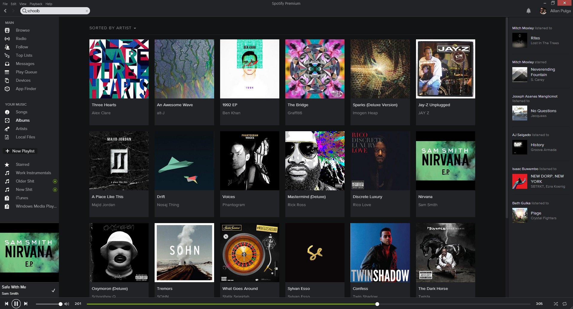
- Portfolio websites,
- Design studio websites,
- Exclusive product presentations,
- Unconventional content.


Tips on Using the Color Black in Design
First things first: even when using a black background, it is important to create a lot of "white space", too, because the black surface is visually smaller. The white background also serves as a “break” which is a thing that is missing on a dark background. It is also important to check usability more thoroughly. In my experience, you should never use a light font weight and it should always be 2 or 3 px bigger than the same one on a white background.
As already mentioned, the biggest problem with black backgrounds is readability, and every designer should know how to handle it (hint: increasing the font size, kerning, leading).
When picking dark backgrounds as your base, you need to remember that the chance for you to use conventional, learned design elements lowers. Aside from the fact that designers should think a bit harder about the usual elements, they should also put in an effort to make content more interesting and effects more creative.
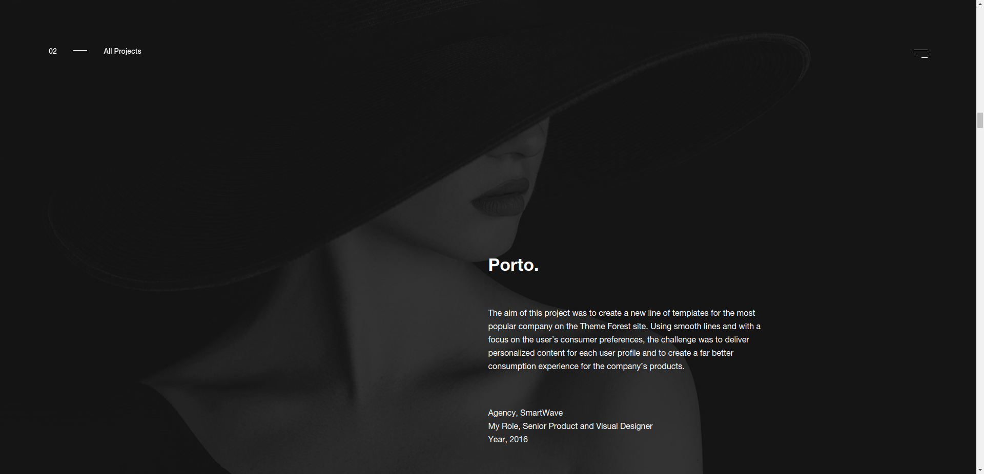
What you need to pay attention to, as well, is which color shades to use. There are text about how you should always use tinted black color in design and that this tint should come from the main color you use. Examples that I added are using tinted and true black (#000), so I think that idea is optional.
The idea to tint the base color comes from nature, where it’s very hard to see shades #000000 and #ffffff (not just because of the format).
Another problem lies in the fact that night modes use exactly this "problematic" arrangement (black background layout). Every browser extension and tool for optimization in dark surroundings offers the option for you to use a dark background and white text. Also, if there is an option to change the surrounding color in an application, there is always the black background option.

Situations in Which You Can Always Use a Black Background
This post may be about websites with black backgrounds, but I want to touch upon a couple of elements which function great with the black background. Chances are that you’ll be creating these elements at one point or another, so all of the above will surely come in handy. The elements I’m talking about are:
- Emphasized sections,
- Header/footer/navigation,
- Comments,
- Pop-ups.


Remember when I said how in design, emphasizing plays a huge role and black can really help you do this right. A black background in a header is not all that common, but it’s not entirely surprising, either. The footer can be darker, too, because both the header and footer symbolize the edges of website content, and it can be pretty user-friendly to color them darker.
The same goes with other elements I mentioned: sections, comments, and pop-ups. Seeing that they are not the “main content”, they can and should be styled differently.
Conclusion
If you manage to find the right place and time to use a black background, then go for it. However, bear in mind that these opportunities happen rarely and if you do get your chance, you’ll probably need to wait a lot for the next right moment to come around (otherwise you're really lucky).
You can personally like the color black (there’s nothing wrong with that), but what you shouldn’t be is a designer who uses black in their projects—real designers know better than that. Real designers know how to recognize the time and place for it (and to deal with it along the way).
That’s it from me for now! Hope this post helped you out and showcased some nice examples for all of you design lovers out there.
Examples used respectively:
- https://www.apple.com/mac-pro/,
- http://www.formigari.it/,
- https://uppertodo.com/,
- https://www.spotify.com/,
- http://culture.basicagency.com/,
- https://ninjatune.net/2017/,
- https://culture.doberman.co/,
- http://www.tramont.in/,
- https://20jahre.stimmt.ch/,
- https://www.fiftythree.com/paste,
- http://www.ouiwill.com/,
- https://www.strv.com/,
- https://overclothing.com/,
- https://www.weareenvoy.com/.
Creating
software solutions
that work


