10 Website Redesign Tips for 2018

In 2018, a website is one of the most important representations of your business. It provides visibility, 24/7 accessibility and is proved to be an effective sales channel.
However, if you want your website to deliver a significant return on investment (ROI), it needs to be well-designed and built specifically for users’ eyes and preferences. Why is that? Let’s see.
Picture the following situation: you, as a CEO of your company, should hold a meeting first thing tomorrow, at 9 AM. Now, would you walk into that meeting completely unprepared and dressed in a hoodie? Probably not. You would dress for the occasion. So, just like you need to dress to impress you also need to redesign to shine online.
You need to make a good first impression. No, not good. The best!
Now, we want you to have the best possible “suite” there is and that is why we decided to write about this year’s website redesign tips.
By now you are probably thinking: why shouldn’t I just buy a new suit? Precisely, why shouldn't you start all over again and build a new website?
Well, for starters, you have to be aware that rebuilding a site means creating new databases, dealing with servers, code and every part of the back-end side. On the contrary, redesigning usually requires improvements in website's visual elements without making changes in the used technology. Additionally, rebuilding is a process that can take too much time and resources. Therefore, if your business website is functioning properly but needs just a bit of touch in design, there is no point in making a new website. Additionally, by doing a redesign you will minimize costs while still getting that “fresh look”.

If you are still hesitant about making changes in the redesign, check out the following facts:
- ESPN.com’s revenue went up by 35% after they incorporated community suggestions into their homepage design.
- Eighty-eight percent of online consumers would not return to a website if they had a bad experience.
- As Invision further states, first impressions are 94% design-related.
As you can see, a first impression is the one that counts.
What can make a good first (online) impression? Well, a website that is mobile-friendly, that has good navigation and visible contact information. These are just some basic website redesign tips.
But, where to start? How to make sure your new design gets you more users and leads? It's pretty simpleーstart with planning. We will cover the planning part in some other article. For now, all you need to know is without planning, the costs can easily go up and the release of the project can be delayed.
Now, let's get to the actual website redesign tips that will help you be more visible and easily reachable to your users/leads:
Tip No. 1: Lower Page Loading Time
We mentioned the importance of having a fast page in the article that covers 10 ways to improve your website design. Now, let's dig a bit deeper.
It is a well-known fact that people don’t like to wait for anything. Unfortunately, impatience is even more emphasized in the digital world. So, remember that your user doesn't have the time to wait for a web page to load.
Let’s check the actual facts. Did you know that slower page load can directly affect your revenue? More precisely, did you know that it can result in a significant drop in revenue, in some cases 1% loss for every 100ms delay? If this information didn’t make you think maybe this one will: almost 33% visitors bounce when page speed is 7 seconds long.
Fun fact: There is no difference between page speed and page load time.
These statements just prove that lowering page loading time is one of most significant website redesign tips you should have in mind.
Want to improve it? Start with checking your current page speed.

Tip No. 2: Include a Web Animation
This is one of the newest website redesign tips. Web animation goes hand in hand with lowering page loading time. Why? Because both of these elements are affected by impatient users.
How are these tips connected?
Well, as Telegraph once stated, people nowadays have lower attention span than a goldfish. That being said, a visitor doesn’t have the time to wait for the page to load or to read long contentーif it takes to much time to read it, there is a good chance something else will catch visitor's attention. If your website is not interesting or fast enough, chances are you will be left with just a handful of users.
So, where to include a web animation? Well, according to Creative Bloq, you can include it in almost every part of the website. The most popular ones are included in logos or as a background videos on landing pages. Additionally, keep in mind that adding a hover over a button is always a good practice, as well.
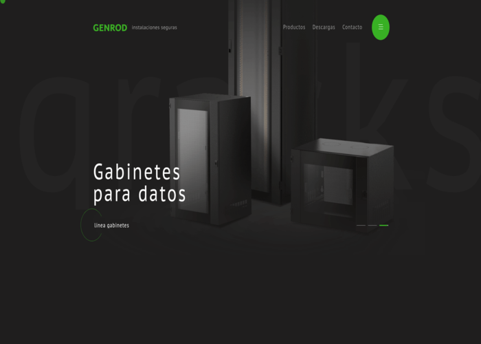
If you need some inspiration, be sure to check GENROD, Oleg Gert or Mathis-biabiany.fr.


Tip No. 3: Make the Site Mobile-friendly
If you can’t think of any good reason why you should make your website mobile-friendly, remember this: Google loves these types of websites.
Why is that?
Well, let's see what Google has to say. In March this year, Google officially announced mobile first indexing. This means that the mobile version of your website is a starting point which Google includes in its index (which is how the rankings are determined). But, don't worry, if your site doesn't have a mobile-friendly version, the desktop one is the one that counts. However, a site that has a mobile experience will be ranked better than the one that doesn't have it.
What do you get by making the website mobile responsive? For starters, credibility and reputation. Additionally, your business will be perceived as modern and important in the community.
Making your website mobile-friendly is one of the best website redesign tips we can give you.

Tip No. 4: Don’t Forget About SEO
Never underestimate an SEO’s role in creating content.
You might think that quality content has a way to find its path to users' hearts. Although it is trueーquality content can attract more usersーit is not nearly enough. A content has to be optimized for both browsers and readers. It has to be Google-friendly while still being easily readable.
If you are skeptic, check the facts! According to Hubspot, 61% of marketers pay attention to SEO to grow their organic presence. Additionally, 40% of marketers agree that the toughest task of SEO is adapting to changes in search algorithms.
In order to make this process a bit easier you should know that, for 2018, one of the biggest website (re)design tips is adding Robots Meta tags, which provide search engines with instructions on how a content should be indexed and presented in the results. None of the Meta Robots tags are visible to website visitors but can work wonders.

Tip No. 5: Add Even More Optimization
This time we are talking about conversion rate optimization.
What is a conversion rate optimization? According to Moz.com, this type of optimization consists of ways to increase the number of visitors who are willing to take an action. creating your landing pages so a user can easily contact you, make a purchase or make any other move. In short: this is one of the website redesign tips that is going to help users reach your CTA in no-time.
Unlike the SEO optimization that takes time for Google to recognize it, conversion optimization doesn’t require that much time to get you results. Keep in mind that it can bring results quickly but it requires testing and a bit of time to find what really works.
So, what do you need to do in order to have the right CRO? Analyze how users move through the site and which actions they take. Is there anything that is stopping them from making a conversion?

Tip No. 6: Flat Design 2.0
Yes! Flat design 2.0 has some extra cool features.
Let’s back up a bit. What is a flat design? This is a minimalistic graphics style that uses features in a two-dimensional space. If you can remember, 2000s were full of graphic website elements. Suddenly, the times changed一a minimalistic, 1.0 approach to design was supposed to offer the best user experience. However, it didn’t manage to deliver. Although it was created as an approach that will lead a user to call-to-action, somehow users missed CTAs and were even more confused.
Then we said hello to the 2.0 version.
Now, the second version of the flat design is full of gradients, highlights, and shadows. Flat design 2.0 is all about making depth and getting the 3D, real-feel of this type of design.
One of the best website redesign tips we can give you: be sure to include it. You won’t regret it.
Check out these websites for inspiration: Supremo and Logram.


Tip No. 7: Social Media Links
Social media buttons or links are a necessity nowadays. Did you know that one of the ways you can boost page and domain authority is to share a content on social media? However, social media’s role is not just in increasing traffic. These links build visibility and credibility in your community.
So, where should you put social media links? Well, it’s up to you to decide whether you want to go with top, middle or the bottom of a webpage. However, the important thing is to make those links open in a new window, so your visitors don’t leave the website.
Tip No. 8: Colors & Typography
Colors and typography are two basic elements in web design so be sure to follow all the trends that involve these two elements.
Currently, one of the major web design trends is a gradient. In 2018, gradient moved towards typography. If this sounds too plain to you, consider adding a gradient highlight. On the other hand, if you are not feeling this gradient trend don’t worry一there’s a backup plan. Try adding image-filled typography to your landing page. You’ll see, it can make quite a difference and a modern feel to your website.
If these trends did not impress you or just don’t go along with what you had in mind, be sure to check the Design’s Hack article to find the one trend that will suit you the best.
When it comes to choosing colors, there are no website redesign tips you should follow. That being said, we have to mention a color of the yearーUltra Violet (18-3838). The good thing about purple is that you can use it muted, saturatedーit is easily adaptable to any industry.
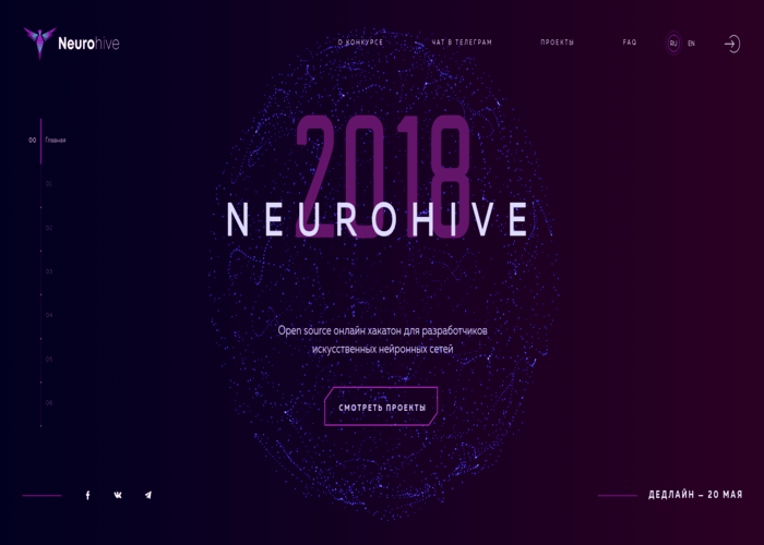
Check out these examples on image-filled typography (Nurture Digital) and using purple in the design (Neurohive.io).


Tip No. 9: Progressive Web Apps (PWA)
We are sure you have heard about this term. If you are not familiar with it, get on this bandwagon since this is one of the website redesign tips you definitely shouldn’t skip. In 2018, PWAs are going to take over the digital world. Why is that? Because these types of apps, provide the best of both worldsー a website and an app.
Let’s check the statistics. According to AppInstitute, user engagement can be increased by 136%, while conversions can increase up to 52% when you include PWA in your web design.
So, what should you include in a PWA? Should you add push notifications or animated page transitions? Or both, perhaps? Well, our advice is this: try to mix the best sides of websites and apps to get the greatest results. In fact, don’t think too much about it. Let the designer handle it. He/she should know how to include these elements and create a perfect user experience (UX).
Tip No. 10: Make Constant Improvements
When you are done implementing all the previously mentioned tips, there is just one more thing you should knowーthose tips are a great starting point. So, if you really want to make the website redesign pay off, you constantly need to make UX updates and improvements.
There is no success without constant enhancements in web design.
And that's it! These are the 10 website redesign tips you should bear in mind.
So, what comes next? Testing and launching the project.
Testing and Launching
Once the website redesign is completed, you probably can't wait to launch it. However, there is one more step before the official launch that will make sure all your efforts paid off. The step in question is testing.
Here are some questions you should ask yourself while testing:
- Does the website function/look the way it was planned?
- Do the old pages redirect to new ones?
- Is there a backup plan if the site crashes?
If you have positive answers to all these questions (and many more) and feel you can move on to the launch.
Once you launch the website, our advice is to never stop testing and improving. How are you going to manage that? Add a survey regarding the new design on your website and acquire users’ opinions first hand.

In the End... Should You Do All This Work by Yourself?
Definitely not! There is a whole industry dedicated to improving user experience in web design. So, instead of trying to do it all by yourself, leave it to the professionals.
Whether you decide to go with a development company or a freelancer please make sure you found the right one. A good web designer knows all the principles of web design and how to meet previously defined goals.
What is your experience with redesigning a website? Did you implement all these tips? Do you have anything to add?


