The box-shadow property is used to add a shadow effect to an element.
This property is used quite often to give depth to elements on a website, so it is useful to fully understand it.
The Syntax
The syntax for the box-shadow property is the following:
.box {
  box-shadow: 5px 10px 5px 4px #666;
}
Let’s translate this so you can understand what each of the values means:
box-shadow: horizontal offset | vertical offset | blur radius | spread radius (optional) | color
Values
- Horizontal offset - how far to the left or right will the shadow spread (if the value is positive it will spread to the right, if it is negative it will go to the left),
- Vertical offset - how far above or below the element will the shadow spread (if the value is positive it will spread to the bottom, if it is negative it will go to the top),
- Blur radius - the higher the number, the more blurred the shadow will be, if the number is 0 it will be sharp,
- Spread radius - the default value is 0, the higher the number the bigger the shadow size will be,
- Color - defines the color of the shadow.
Examples
CSS
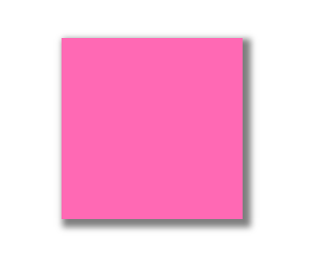
.box {
  background-color: hotpink;
  height: 200px;
  width: 200px;

  box-shadow: 5px 5px 10px 4px rgba(0,0,0,0.5);
}
The result:

Usually, we won’t use a solid color for a box shadow, adding some opacity gives it a more natural feel.
Inset Shadow
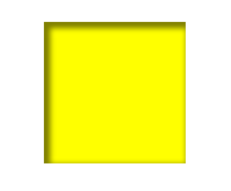
When creating an inset shadow, the effect is the shadow goes inside the element, and makes the content look depressed inside the element.
CSS
.box {
  background-color: yellow;
  height: 200px;
  width: 200px;

  box-shadow: inset 5px 5px 10px 4px rgba(0,0,0,0.5);
}

Two Different Shadows
We can also create an element that has two different shadows, with different colors.
CSS
.box {
  background-color: orange;
  height: 200px;
  width: 200px;

  box-shadow: 5px 5px 10px purple, -7px -4px 4px green;
}

Solid Shadow
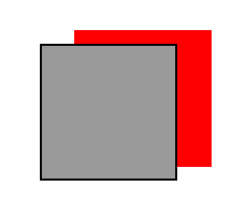
CSS
.box {
  background-color: #999;
  border: solid 3px #000;
  height: 200px;
  width: 200px;

  box-shadow: 5rem -20px red;
}

We see from this example that the use of a solid shadow is good, but usually giving it some spread and opacity results in a far better effect.
Box Shadow Generators
Now that you have understood the property, and seen it in action, it is a good idea to mention that there are also a lot of generators you can use. It can often be quite difficult to translate the design imagined into the box-shadow property values, so there are tools that can help you.
You can use CSS matic, CSS3 Gen, Mozilla box-shadow generator. All of these help you visually achieve the box shadow effect you want.
Browser Compatibility
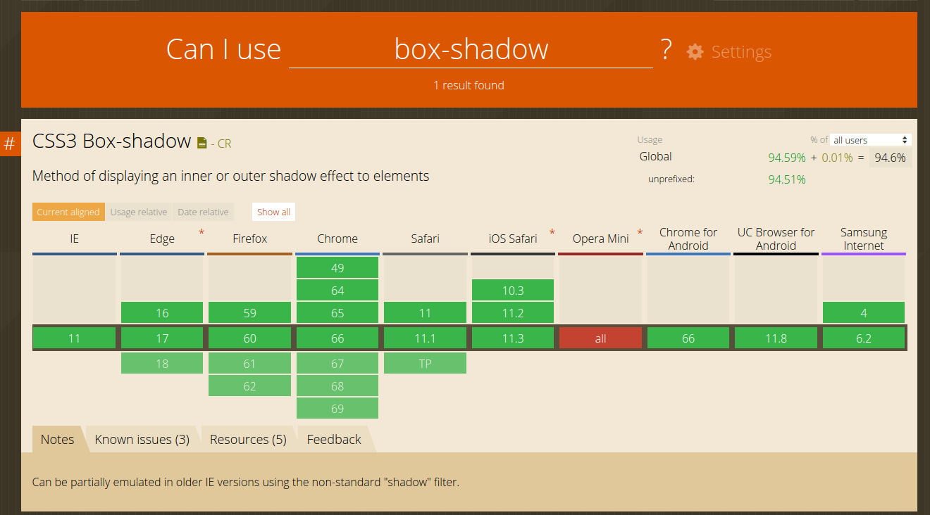
As mentioned in our previous article, it is a good practice to check the browser compatibility of new properties you are learning. Currently, the best service to use is the CanIUse.

We see the browser support is very good, except when using Opera Mini. You should be aware that this feature won’t work there.
Conclusion
We have explained the box-shadow property and what all of its values stand for. Now, it’s up to you to further explore and unlock its full potential.
Thank you for reading!
