Every beginner should first start with the basics. In the case of CSS, the basics are learning the box model. Before proceeding with learning any other CSS concepts, this is the one you should master first!
The box model is the basic building block of CSS.
It does tend to confuse with beginner developers so now is the moment to set the record straight. Here you will learn all the basic elements of the box model and how they are all connected.
Before we dive deeper, everyone needs to understand that every element in web design is a rectangular box. You have probably heard this multiple times before, but this is an important concept that every developer should be aware of.
Now, let’s explain the mysterious box model!
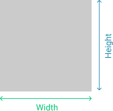
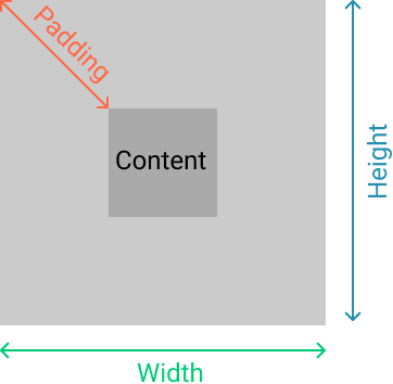
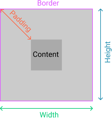
Structure of the Box Model
As mentioned above, the structure of the box model consists of:
- Content (height and width),
- Padding,
- Border,
- Margin.
These are all the elements the browser needs in order to render a box model. Thankfully, with CSS we can control each of them individually. Let’s see how.
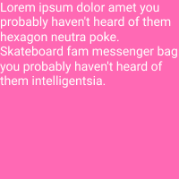
In this article, we will use the following code, and add to it gradually.
HTML
<div class=”box”>Lorem ipsum dolor amet whatever woke cronut, farm-to-table church-key tousled edison bulb. </div>
CSS
.box {
  background-color: hotpink;
  color: #fff;
}
The Content
The content is pretty clear. It is the content of our element that has a specific width and height. A fixed height and width can be set using the height and width of CSS properties, or they can be determined by the content itself.
Now, the one thing that is a bit confusing here is the usage of inline or block-level elements.
Using Inline and Block-Level Elements
To refresh your memory, the difference between inline and block elements is the fact that block elements take up 100% of the container width, while inline elements only take up the amount of space that the content needs.
When using inline elements it is not possible to set a fixed width or height for that element, since the element doesn’t have any predetermined width and height (because the width and height are determined by the content). This can be overcome by converting the element to a block element.
Unlike inline elements, when using block-level elements you can easily set a fixed width or height for it. Since by default, the block-level elements take up 100% of the container width, we can easily override it by setting a fixed width.
You can also convert your element to inline-block. When using inline-block, the element has the behavior of the inline element (only takes up the space of content), but you can manipulate it the same way as you can do with a block element.
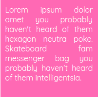
Now when we have a block-level element we can give it a width and height.
CSS
.box {
  height: 200px;
  width: 200px;
  background-color: hotpink;
  color: #fff;
}
The result is this:
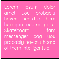
The Padding
Next, we are going to add some padding to our box.
Padding defines the space between the content and the edge of the box.
Let’s see it in action on our example.
CSS
.box {
  height: 200px;
  width: 200px;
  background-color: hotpink;
  color: #fff;
  padding: 10px;
}
The result:
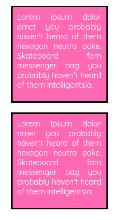
In the image, we see how padding affects the overall look of the box. There is a space of 10px between the content and edge of the box on all four sides. We can also add padding to every side individually, using padding-top, padding-bottom, padding-left, and padding-right.
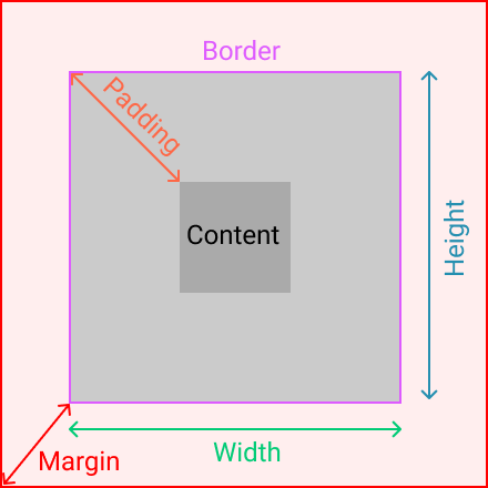
The Border
Since we are going from the inside out, the next step would be defining the border. The border surrounds the content, and you don’t have to use it, but it still exists. This just means that the border has a width of zero.
Now, we will add a border to our example.
CSS
.box {
  height: 200px;
  width: 200px;
  background-color: hotpink;
  color: #fff;
  padding: 10px;
  border: solid 3px black;
}
The Margin
The final aspect of the box model is the margin. As some of you know, the margin is the space outside of the border. It is the space between elements.
The best way to demonstrate this in a practical example is to show you how two elements are positioned with and without margins.
HTML
<div class=”box”></div>
<div class=”box”></div>
CSS
.box {
  height: 200px;
  width: 200px;
  background-color: hotpink;
  color: #fff;
  padding: 10px;
  border: solid 3px black;
  margin: 0
}
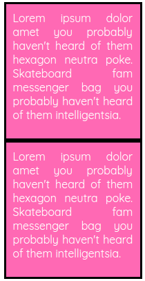
In this example, we see how, without margin, two elements stick together and there is no space between them.
Now, let’s add some margin.
CSS
.box {
  margin: 20px;
}
Now, this looks better. We added some space between the boxes. We can also add space on every side of the element individually using margin-top, margin-bottom, margin-left or margin-right.
Summary
You have made it to the end of this article, congrats! :)
So, what have we learned?
1. Every element on a web page is basically a box.
2. The aspects of the box model are content, padding, border and margin.
3. When using an inline element you can’t set a fixed width or height for that element, while it is possible with a block and inline-block element.
Hopefully, this helped you learn something new or refreshed your memory.
Stay tuned, because in the next article, we will talk about another very important property that helps you calculate the width of the box model, the box-sizing property.
Thanks for reading!