CSS Border-image
The CSS border property is pretty familiar. With this property, you can define the color, style and width of an element border. The border-image property, on the other hand, lets you define a gradient or an image for a border.

The CSS border property is pretty familiar. With this property, you can define the color, style and width of an element border.
The border-image property, on the other hand, lets you define a gradient or an image for a border.
The border-image-property is a shorthand for the following:
- Border-image-source - the source of the image,
- Border-image-slice - defines the dimensions of slicing the source image into regions,
- Border-image-width - defines the width of the border image,
- Border-image-outset - defines the distance between the border image to the element's edge,
- Border-image-repeat - defines how the image is repeated to fill the area of the border.
When using this shorthand, if any of the values is omitted, its value will be set to initial.
The Syntax
When using the border-image property, you can anywhere from one to all the five values mentioned before.
Let’s take a look at the syntax. We will be using the shorthand property.
.box  {
  border-image:
      url(‘images/border.png’)       /* source */
      27 /                          /* slice */
      12px 5px 15px 20px /         /* width */
      5px 12px 17px 22px          /* outset */
      round                      /* repeat */
}
Examples
Let’s show examples of when you want to use a gradient as a border or an image as a border.
Making a Border Out of a Repeating Image
The image we will use when creating the border is the following:

HTML
<div class=”box”></div>
CSS
.box {
  width: 200px;
  background-color: #000;
  border: 50px solid #DE31ED;
  margin: 10%;
  padding: 10px;

  border-image:
      url("../images/border.png")    /* source */
      50 /                           /* slice */
      25px /                         /* width  */
      12px                           /* outset */
      round                          /* repeat */
}
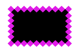
The result:

Making a Border Out of a Gradient
We will use the same box element as in the previous example, only the CSS will be different.
CSS
.box {
  width: 200px;
  height: 200px;
  background-color: #000;
  border: 20px solid transparent;
  padding: 10px;
  margin: 10%;

  border-image: repeating-linear-gradient(60deg, #DE31ED, #31E2ED 50px) 20;
}
The result:

Browser Compatibility
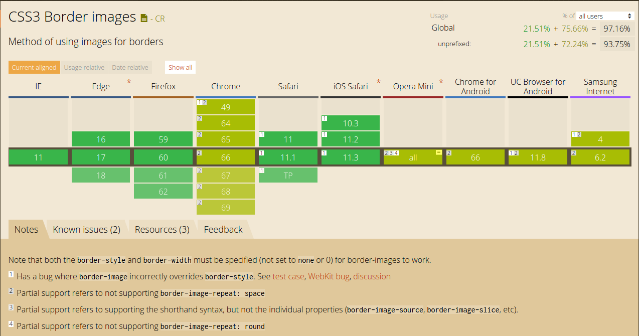
The best way to see what is the compatibility of a property is to check out the CanIUse service.

Here we see that the compatibility is generally very good. There are a few issues with border-image-repeat: space in Chrome, so you should be on the lookout for that.
Conclusion
Although rarely used, the border-image property is quite interesting. It can bring a unique dimension to your design. The best way to see what works for you is to play with the property and unlock its full potential!
Thank you for reading!


