CSS blend mode

Usually, when adding an image to a website, the first thing we do is edit the image in an external software, such as Photoshop. Does the blend mode eliminate the need to use this kind of software? Not really. But, in a lot of cases you will be able to add effects to the image directly with CSS.
When creating your design, you should follow some best practice advice.
Background Blend Mode and Mix Blend Mode
When using the background-blend-mode property, you can blend the background color or image of an element. Blend modes are defined as a value and they specify how to blend or mix the colors of the background image with the color, or other background images, behind it.
On the other hand, the mix-blend-mode property specifies how the content of an element blends with its background and the content of its direct parent. Elements on overlapping layers will blend with those beneath them. In this case, it's important to mention the isolation property. It stops the elements with mix-blend-property from blending with the backdrop.
Background-Blend-Mode
Let’s show the basic usage of the background-blend-mode by blending the background image with the background color.
CSS
.image-blend{
  background: url(‘beach.png’);
  background-color: blue;
  background-blend-mode: multiply;
}


On the top, we see the original image, while the bottom shows the image with blend mode applied to it.
First, a background image URL needs to be specified, and afterwards a background color that the image will be blended with. There are many blend modes available to choose from, here the multiply blend mode is added to demonstrate how it will affect the image. Along with a solid background color, a background gradient can also be used for blending.
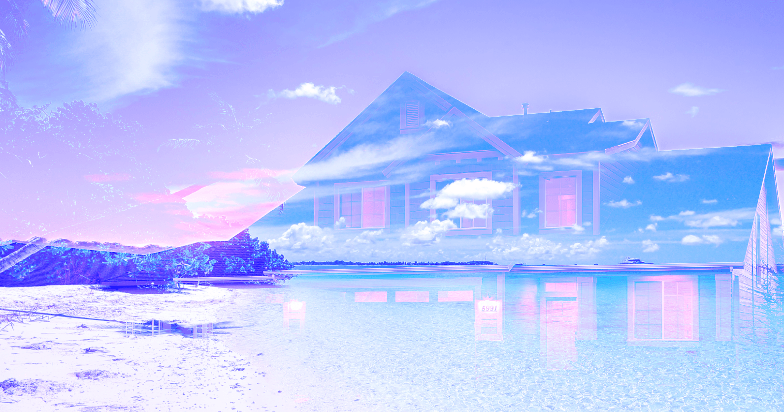
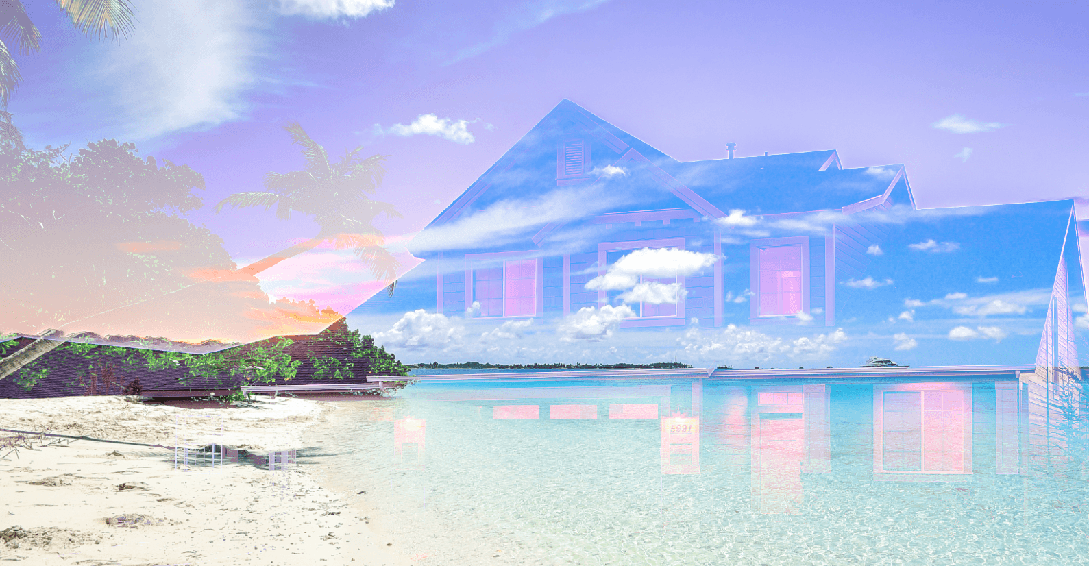
Now, let's look at how we can use background-blend-mode for blending two images. We are going to blend the following two images:

CSS
.two-images-blend {
  background: url(‘beach.png’), url(‘house.png’);
  background-color: blue;
  background-blend-mode: lighten;
}

CSS
.two-images-blend {
  background: url(‘beach.png’), url(‘house.png’);
  background-blend-mode: lighten;
}

In this case, we have two examples, where the first one has a background color added to it, while the second has no background color.
We have demonstrated two possible values for the background-blend-mode, but there are many of them:
- screen,
- overlay,
- darken,
- lighten,
- color-dodge,
- color-burn,
- hard-light,
- soft-light,
- difference,
- exclusion,
- hue,
- saturation,
- color and
- luminosity.
Mix-Blend-Mode
A popular usage of this effect is creating cut-out text. When doing this, it is useful to keep in mind the usage of the line-height property.
HTML
<div class=”container”>
  <h1 class=”header-text”>Hello world</h1>
</div>
CSS
.container {
  background-image: url(‘beach.png’);
  background-size: cover;
}

.header-text {
  font-size: 7rem;
  text-transform: uppercase;
  color: #fff;
  text-align: center;
  background-color: darkcyan;
  mix-blend-mode: multiply;
}

Support
Before using this property, make sure you check out Can I Use for more details on its support for these properties. Currently, the background-blend-mode property has slightly better support, hopefully, mix-blend-mode will catch up soon.
Summary
We have explained the basics of these two properties, now it’s up to you to play with the properties and create beautiful and interesting visuals for your website.
If you liked this article be sure to subscribe to our newsletter - there are much more to come!


